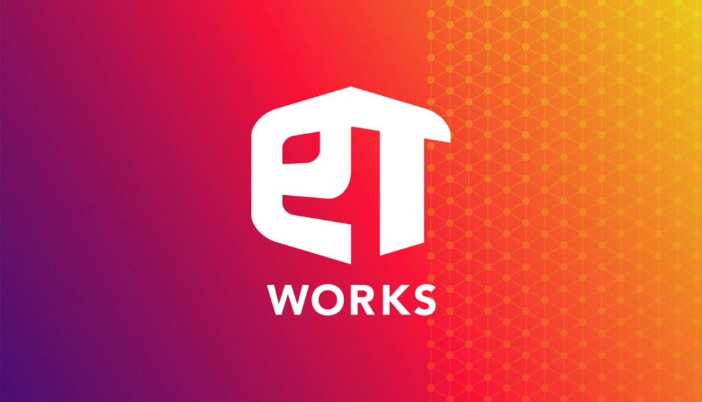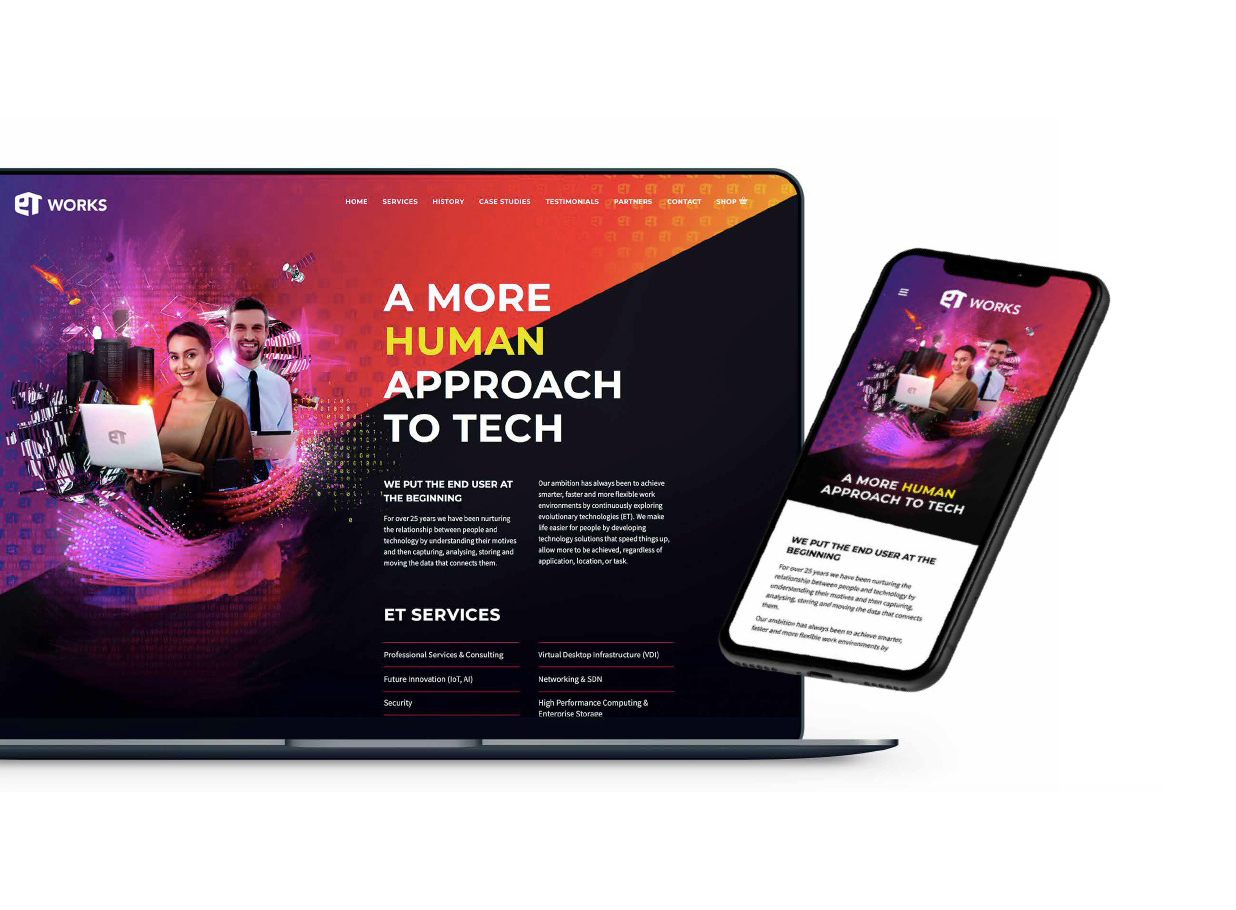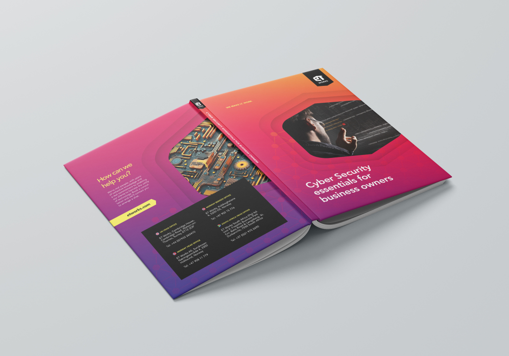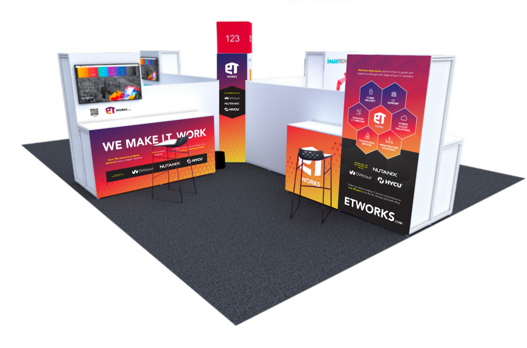
I was approached to design a fresh new brand for IT reseller ET Works.
To distance them from the standard corporate “I.T. image” of clinical blue and white, I devised a vibrant and distinctive colour palette that sets them apart from their competitors. A monogrammed ET cube icon sets the tone for the rest of the brand, with an interconnecting hexagon pattern being used to represent networks, data and connection – as well as the often-overlooked key ingredient to a successful IT enterprise: people.